Deep rich colors creating grounded winter atmosphere

The Color Hibernation

Deepen your palette for winter grounding

Understanding Color Psychology in Winter

As natural light diminishes and landscapes turn monochromatic, introducing deeper, richer colors into your home provides visual grounding and emotional stability. These "heavy" colors—forest green, burgundy, and deep navy—create a sense of depth and permanence that contrasts beautifully with winter's starkness.

This approach doesn't require repainting entire rooms. Small, strategic introductions of these colors through accessories, textiles, and decorative elements can transform the atmosphere without overwhelming your existing design.
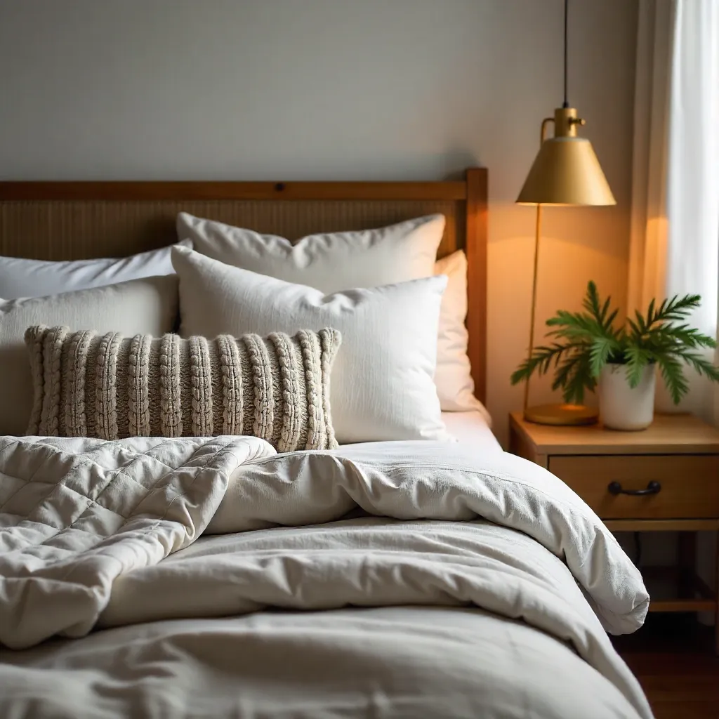
Deepening the Palette

Winter colors work differently than summer's bright, airy tones. They absorb light rather than reflect it, creating depth and intimacy. Understanding how to introduce these colors is key to successful winter design.

Forest Green: This deep, earthy green connects your interior to nature even when outdoor landscapes are bare. It's grounding and calming, perfect for creating a sense of stability. Use it in throw pillows, vases, or accent furniture.

Burgundy: Rich and warm, burgundy adds sophistication and depth. It pairs beautifully with neutrals and creates a sense of luxury. Consider burgundy curtains, rugs, or decorative objects.

Deep Navy: More versatile than black, deep navy provides contrast without harshness. It's elegant and timeless, working well as an accent wall color or through larger furniture pieces.

Starting Small: Accessories First

You don't need to commit to major color changes. Small accessories can create significant impact:

Throw Pillows: Swap light summer pillows for ones in forest green, burgundy, or navy. Mix textures—velvet in burgundy, chunky knit in forest green—for added interest.

Vases and Decorative Objects: Introduce color through ceramics, glassware, or decorative bowls. A single forest green vase or burgundy candle holder can anchor an entire room.

Artwork: Change out lighter artwork for pieces featuring deeper tones. Even a small print with burgundy or navy accents can shift the room's mood.

Creating Visual Grounding

These deeper colors work by creating visual weight at the bottom of your space. Place darker elements lower—rugs, floor cushions, lower shelves—to ground the room and create stability.

Balance is crucial. Too many heavy colors can feel oppressive. Pair deep tones with lighter neutrals and warm lighting to maintain openness while adding depth. The contrast between light and dark creates the chiaroscuro effect that makes winter interiors so compelling.

Consider the psychology of these colors. Forest green suggests growth and renewal even in dormancy. Burgundy evokes warmth and richness. Deep navy provides calm and stability. Together, they create an environment that feels both protective and nurturing.

Room Transformation Strategies

Living Spaces: Start with a deep navy or forest green area rug. Add burgundy throw pillows to sofas. Introduce forest green through plants or decorative objects. The combination creates layers of depth.

Bedrooms: Use burgundy or deep navy for bedding or curtains. Add forest green through bedside accessories or artwork. These colors promote rest and create a cocoon-like atmosphere.

Dining Areas: Introduce color through table linens, centerpieces, or wall art. A burgundy table runner with forest green napkins creates an elegant, grounded dining experience.